Building a brand from scratch.
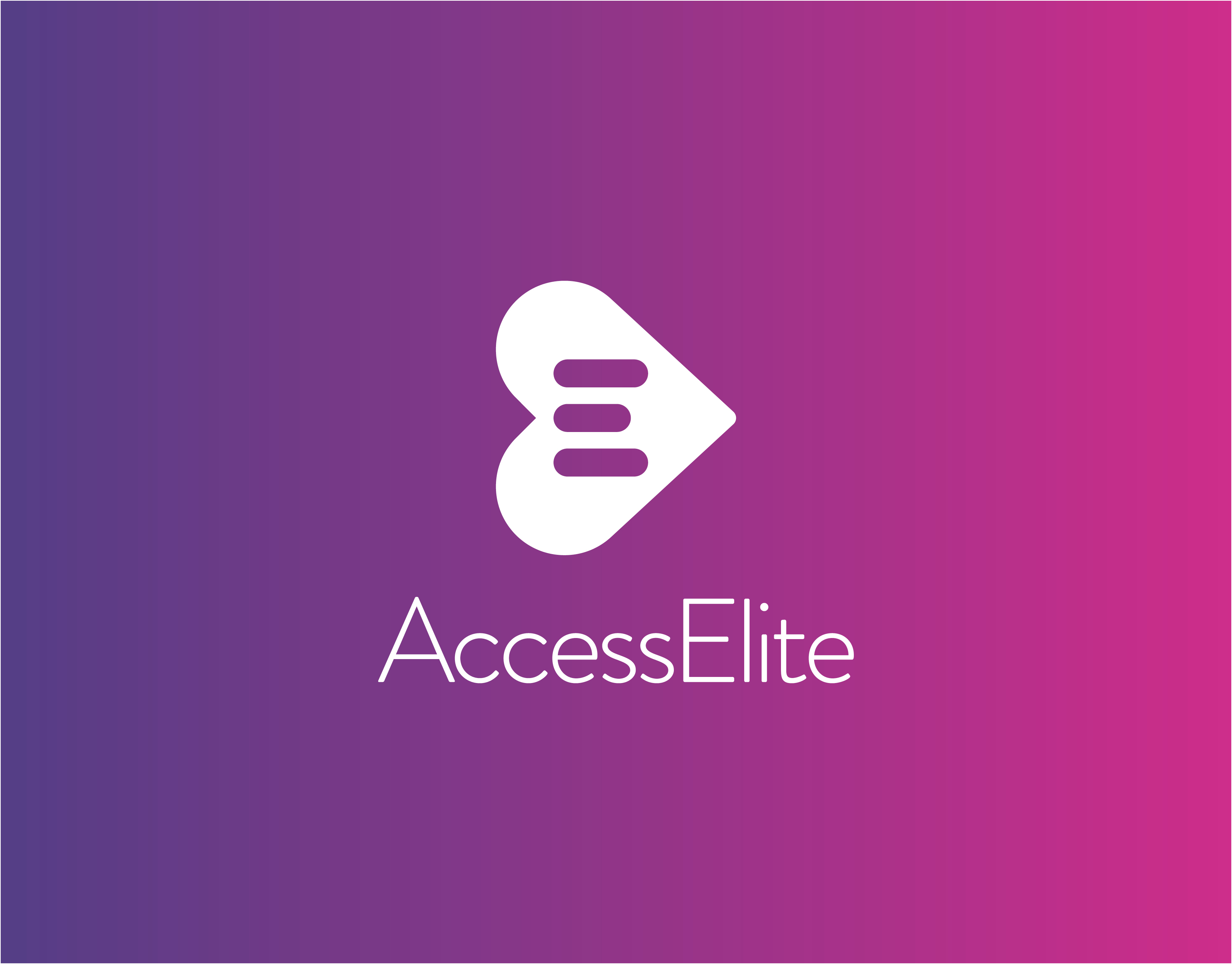
The Logo
The AccessElite logo comes from the heart, the most important organ in the human body.
Taking the traditional heart shape and rotating the form ninety degrees, along with the addition of a left to right gradient, the combined design treatments create a sense of forward motion and direction that expresses the idea of taking control and moving toward a healthier you. Three simple, clean and modern lines represent the letter E, evoking an expression of quality that is at the core of the Access Elite service.
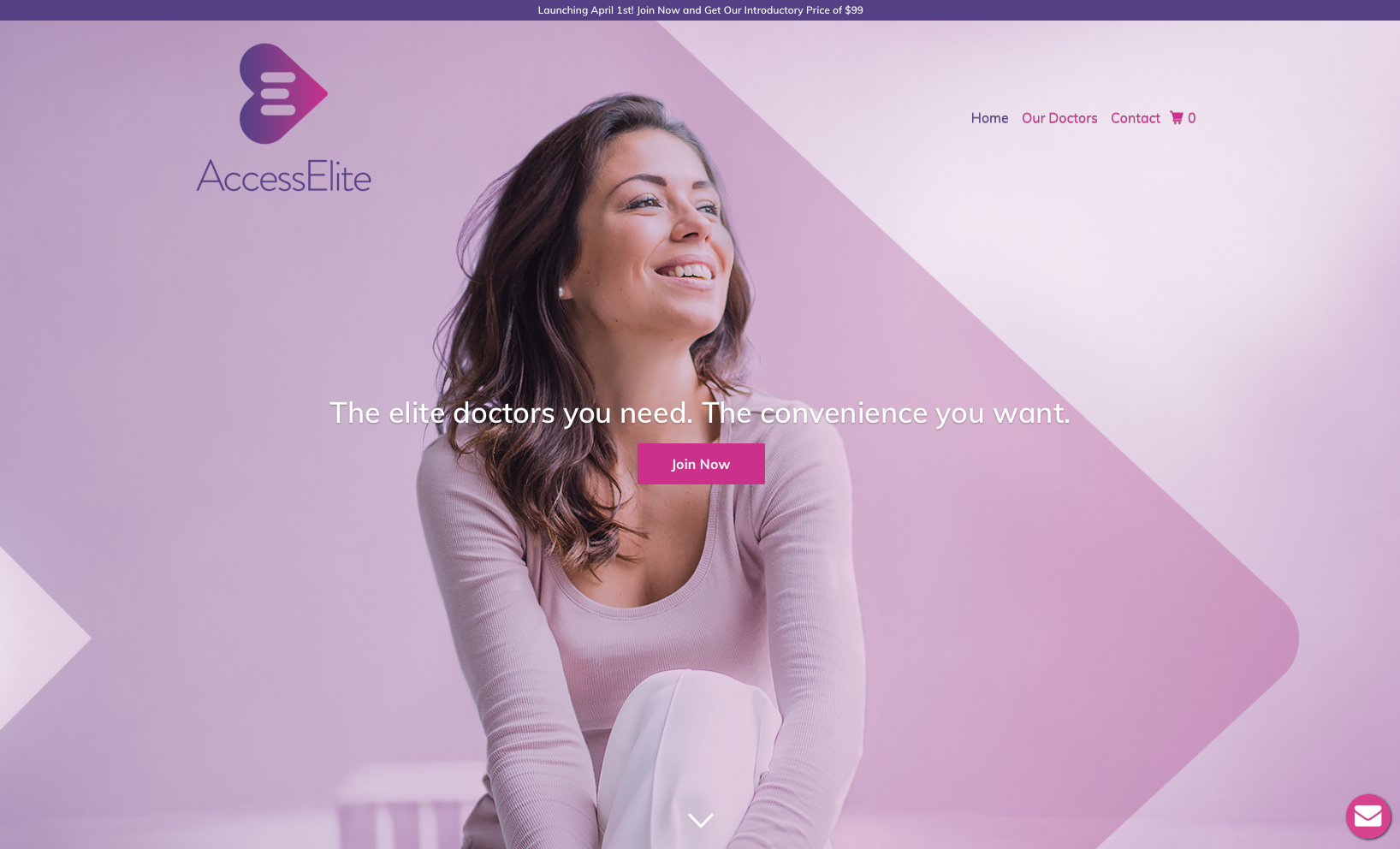
AccessElite_Website
AccessElite_StyleGuide
[3d-flip-book mode="fullscreen" urlparam="fb3d-page" id="2144" title="false"]